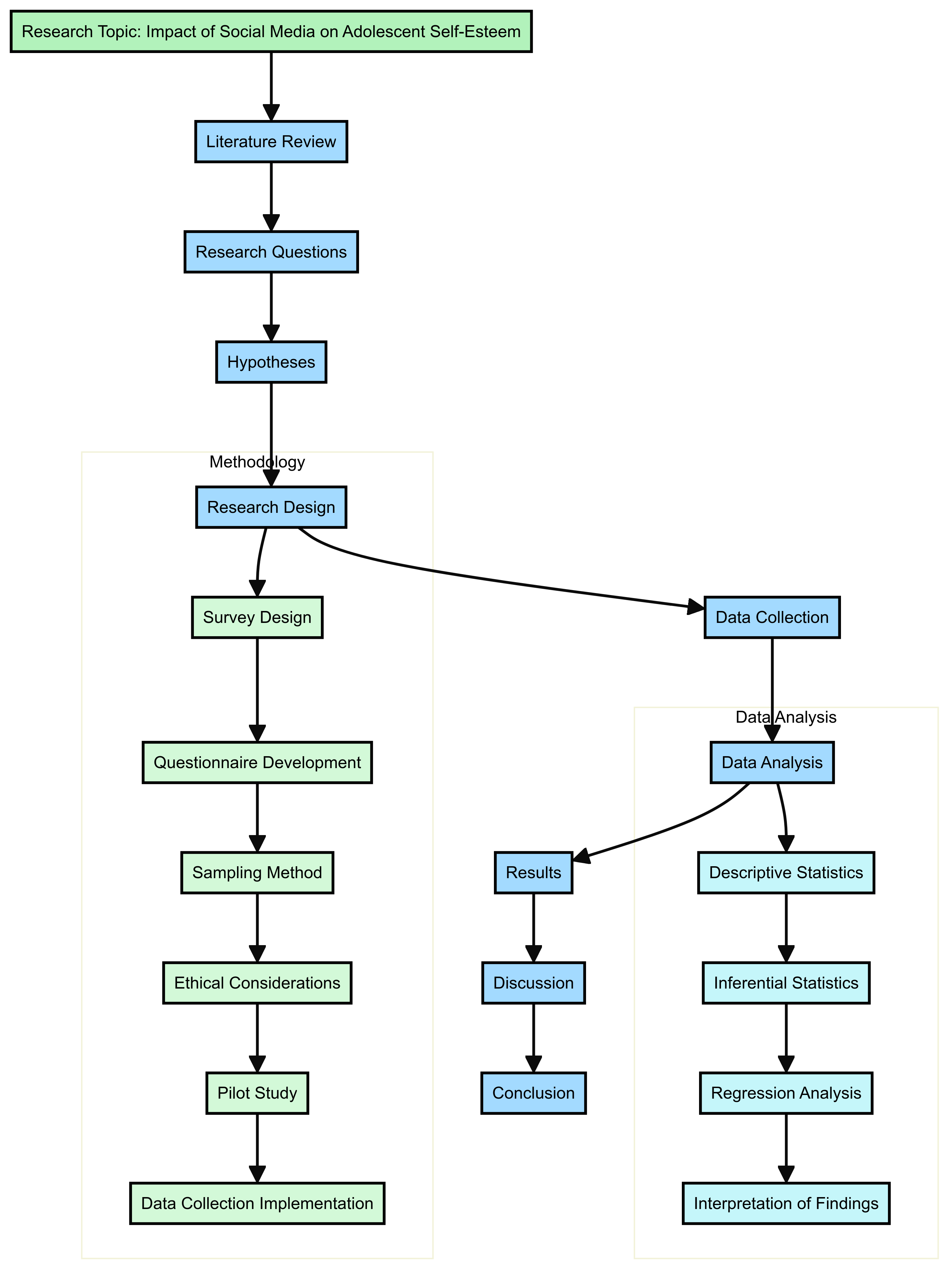
While AI-generated images are becoming more impressive almost every few months, as of 2024 it’s still fundamentally ‘art generation’ and we’re a very long way from AI being able to generate complex technical diagrams. That said it is possible where certain diagrams have strict design schemas which an LLM can generate code for via a prompt, e.g. simple process flows via Lucid GPT or Mermaid diagrams using the Claude Sonnet 3.5 ‘artifacts’ interface, here’s an example of the latter where the prompt was simply to generate a flow diagram for a social science research methods process of its choice:
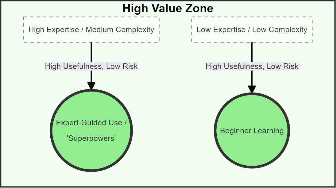
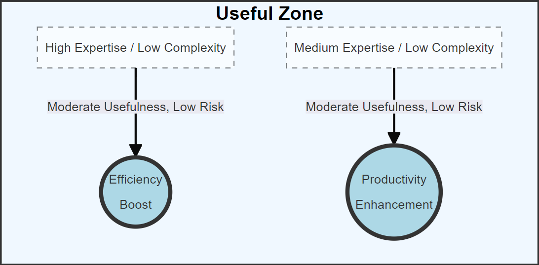
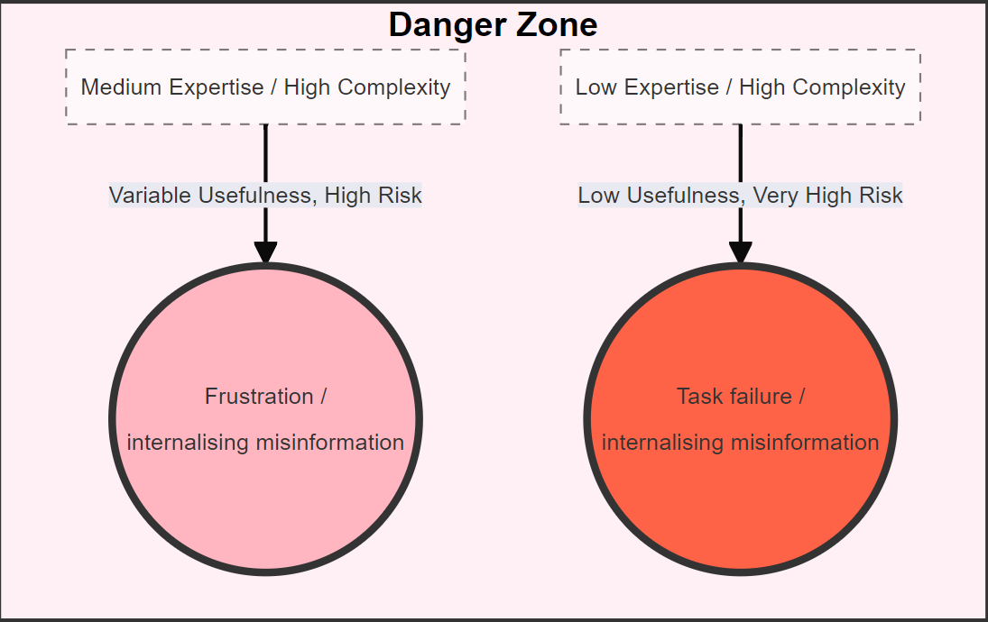
Here's an example of a more conceptual diagram to illustrate the value and risks of using LLMs given pre-existing domain knowledge, which can be presented as a flow diagram of sorts, but it’s a bit of a hack and more difficult to customise if you need to adapt relative spacing - for this example the layout works perfectly well though:
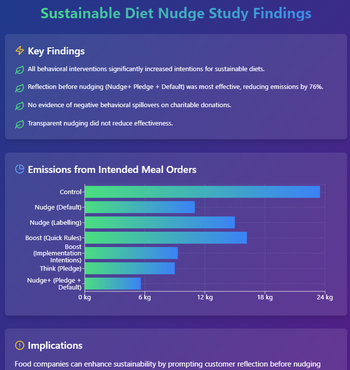
The Claude Sonnet 3.5 Artifacts feature also generates live web views using modern web user interface controls which can create visually appealing infographics from provided text which could be a useful way to create visually attractive presentation slides. Here's an example where the prompt was simply "Attached is a draft of my paper. Can you please generate a nice modern infographic using React elements in the artifacts interface that summarises the main findings from the research in a cool visual way?" based on an uploaded paper:
As far as academic research is concerned though, art generation generally is of limited value outside dissemination (presentations, posters, blogs etc.), though there is potential for generating images designed to elicit responses in psychological tests. Currently, the best quality images are produced by MidJourney, Flux (available to paid users on Twitter) and Dall-E 3 (which can be accessed via MS Copilot, but is also built in to Chat GPT Plus or Chat GPT Team).
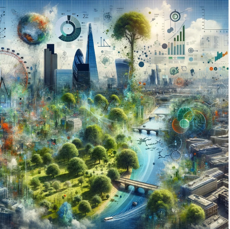
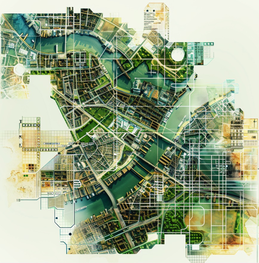
Below is an example comparison asking for a suitable concept image for the title slide of a presentation for a work in progress research seminar on urban green space in London, the research for which comprises a combination of GIS and econometrics.
Here's the result from Dall-E 3 – which tried its best to tick all the keyword boxes, almost to the extent that it’s showing off, resulting in arguably a less visually appealing image due to being so visually ‘busy’:
Here’s the result from MidJourney for the same prompt, while still a little busy it's simpler and more appropriate for a conceptual PowerPoint title slide:
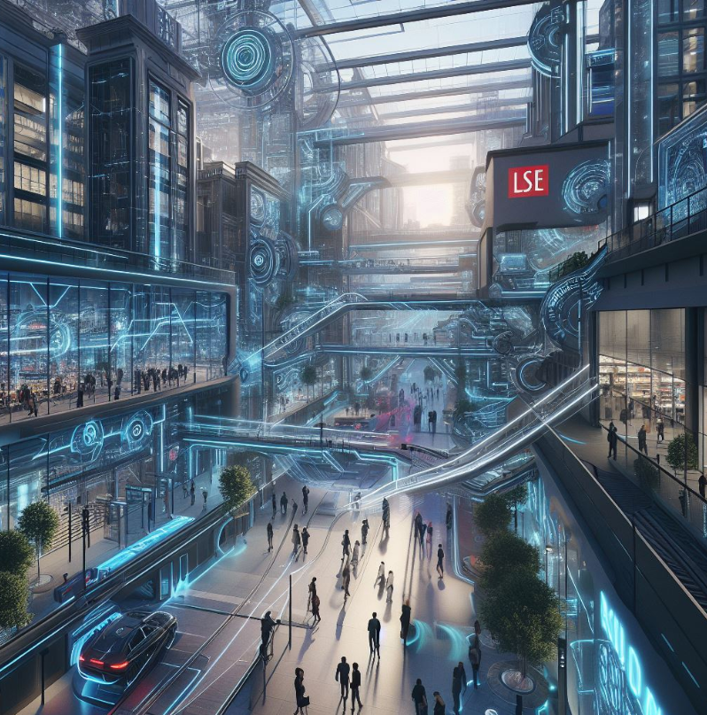
The inherent mismatch between text and image means it will always be difficult to create the perfect visual from a text prompt alone, but with some experimentation it’s possible to get decent quality results. Here’s a more frivolous example for a presentation on digital transformation at LSE, asking it to take an existing photo of the LSE Campus and re-imagine it in the year 2300 with a high-tech aesthetic, fine for a playful artistic touch on a presentation or blog, but certainly not anything you would want an architecture firm to build:
Copyright and Intellectual Property issues
It's worth being aware that there are ongoing legal cases regarding AI art and intellectual property. This likely won't be resolved any time soon because it's a fundamentally new phenomenon: learning to identify artistic patterns based on publicly available data (something that's acceptable for human creatives who can use terms like 'inspired by') isn't as straightforward as replicating others' work, which existing IP laws can sanction. But despite the inherent basis of generative AI in creating novel outputs, there is a chance it could reproduce work close enough that it could be identified as breaching IP. This is the reason the major AI providers like Open AI, Google and Anthropic have put in such extraordinary lengths to refuse any requests that may relate to IP. Some publishers like Elsevier - who understandably have an interest in IP - take a very strong line on not permitting AI-generated art in submitted academic work because of the potentail IP concerns. So it's worth erring on the side of caution for AI-generated images.